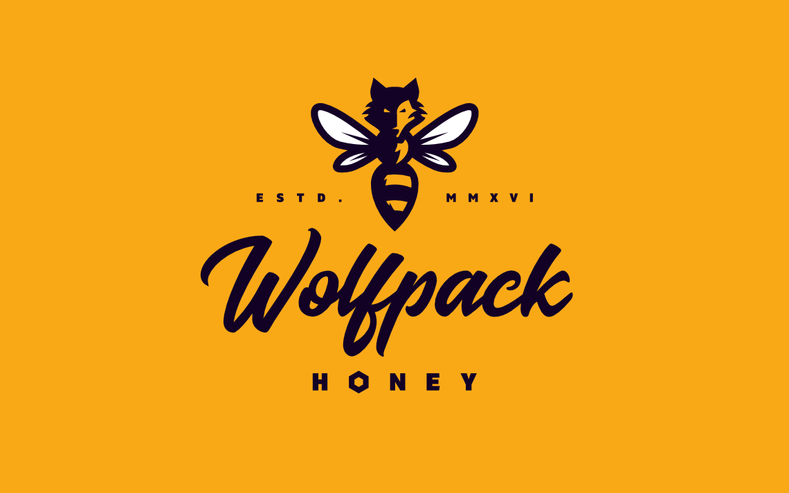
Wolfpack Honey
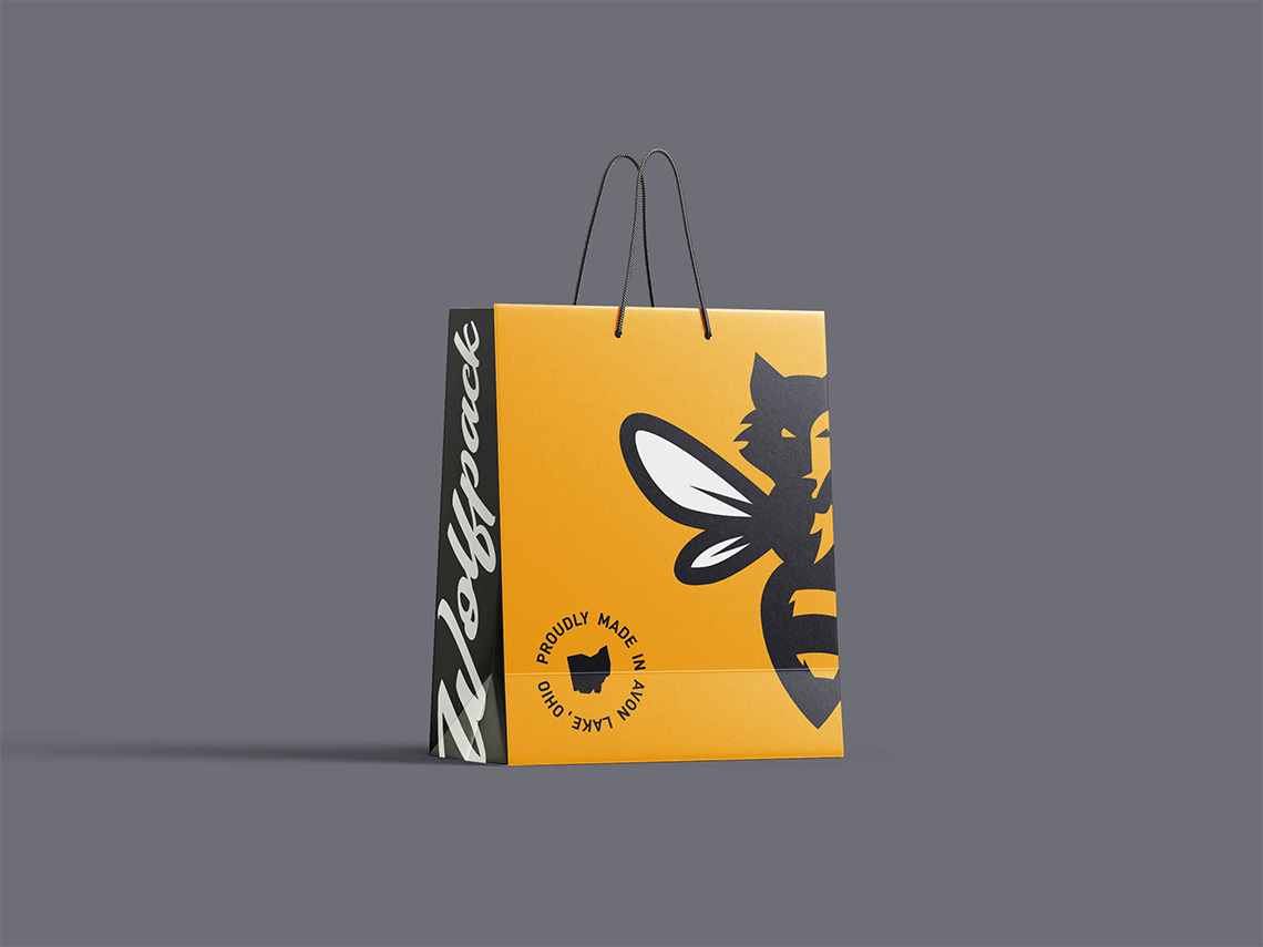
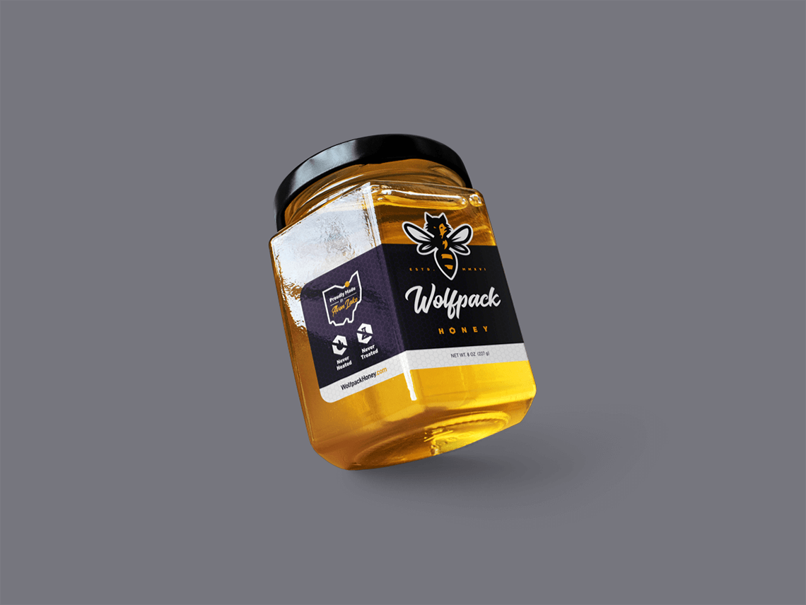
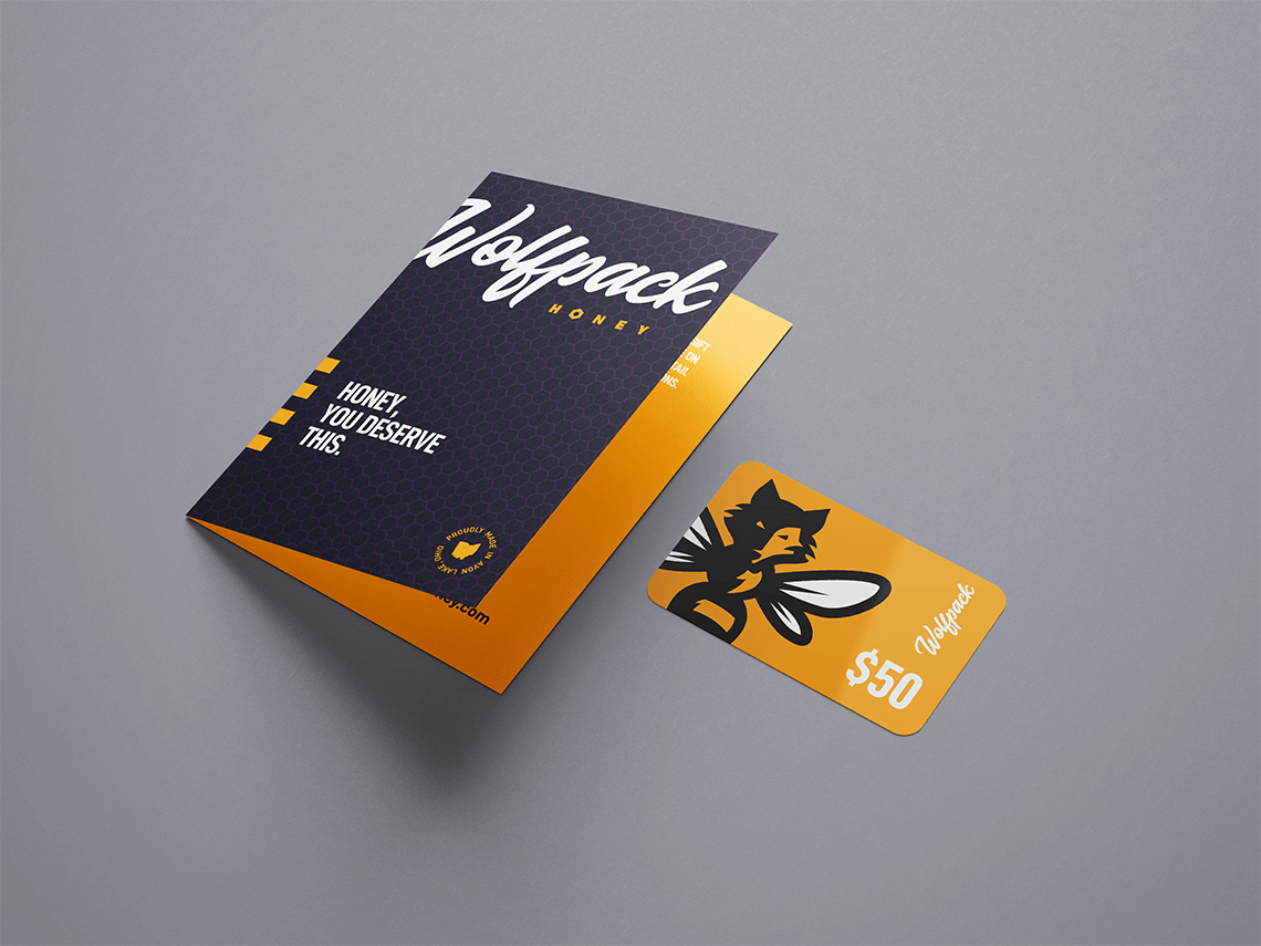
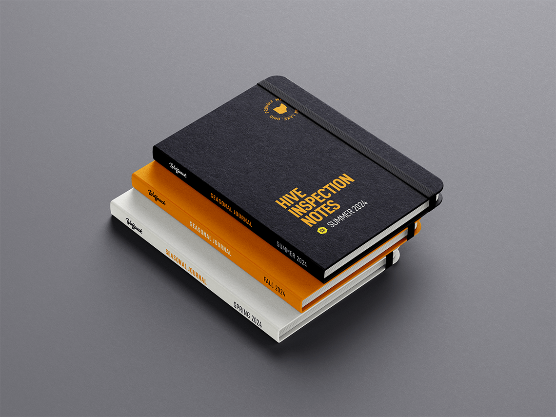
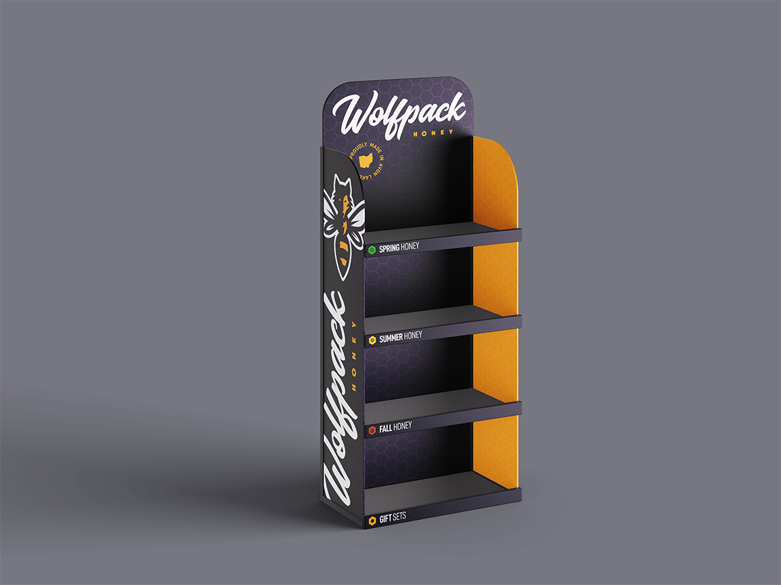
Wolfpack Honey, a beekeeper and small-batch honey retailer in Avon Lake, Ohio, needed a bold, high-end brand to reflect its core values of sustainability, purity, and bee conservation. The goal was to stand out from traditional farm-themed honey brands and pay homage to the owner’s loyal supporters, the “Wolfpack.” The project involved creating a dynamic logo, jar labels, and a brand aesthetic that extended to point-of-purchase items and swag, blending the fierce qualities of a wolf with the elegance of a bee.
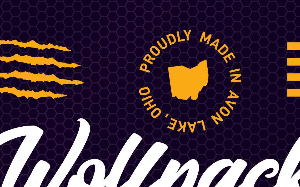
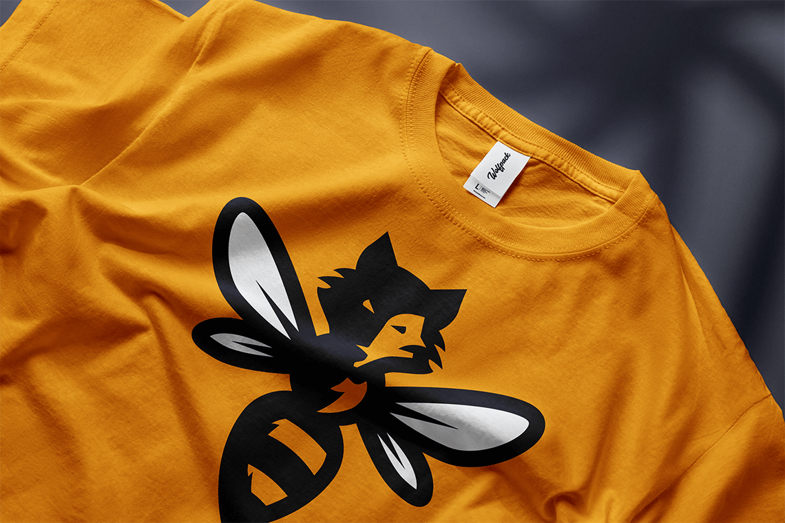
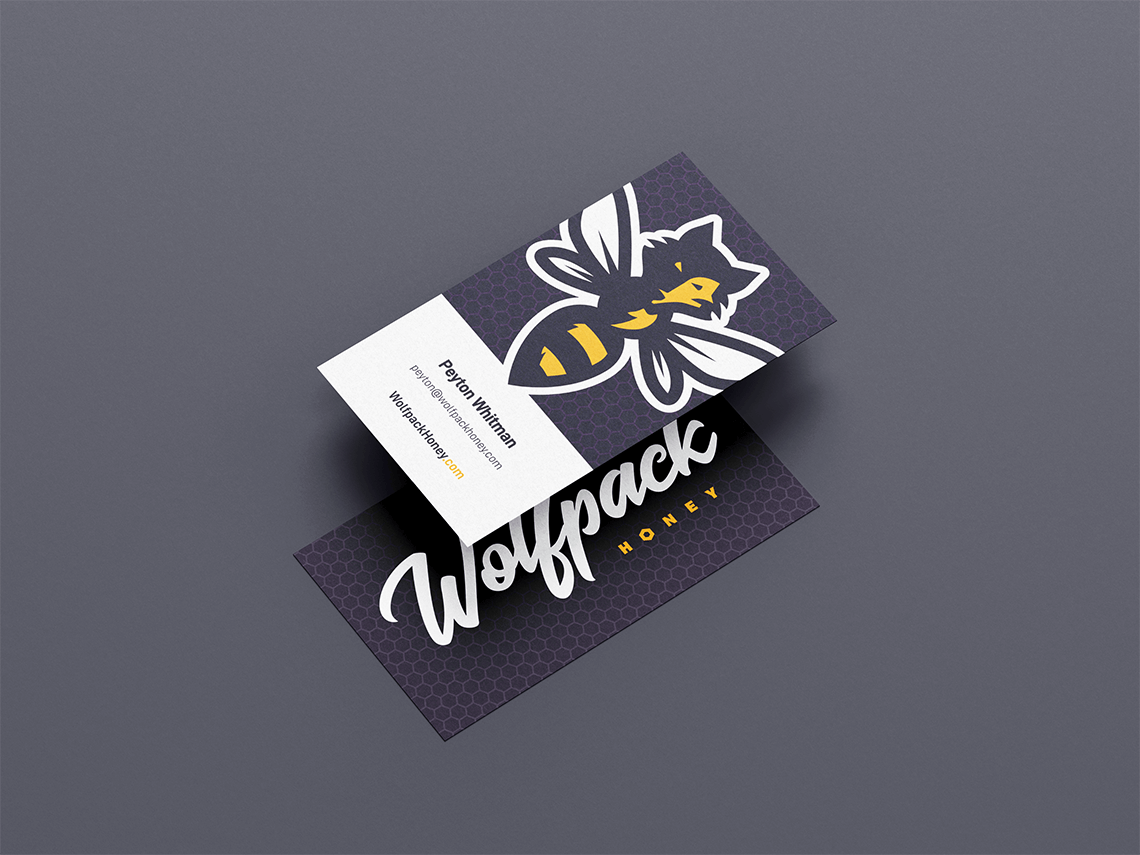
Due to the brand’s extreme conservation values, the goal here was to honor the bee, making it the standout element of the branding. This led to the creation of the “Wolfbee” mascot, a hybrid character that embodies the brand’s “wild meets refined” ethos. This ethos can be seen within the logo lockup itself where the iconic brand mark and refined “Honey” subtext literally and metaphorically ‘contain’ the energetic brush-style word mark. Elsewhere in the branding, geometric honeycombs and bee stripes are juxtaposed with wolf claw marks, once again riding that line.
The color palette introduced a very dynamic rich purple to pair with the golden orange, once again creating distance from the rest of the pack (pun intended) of honey companies that so often go with more subtle earth tones. Reinforced by a local stamp to build trust and pride, the final brand is bold, eye-catching, and distinctive, successfully positioning Wolfpack Honey as a standout in the market.
- Icons, Logo, Packaging, Print
