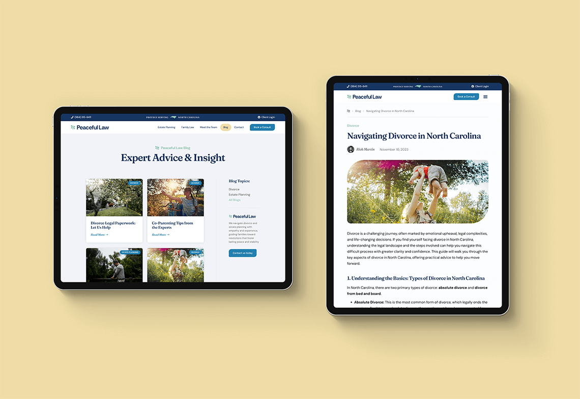
Creating a calmer, more human visual system for a different kind of family law practice.
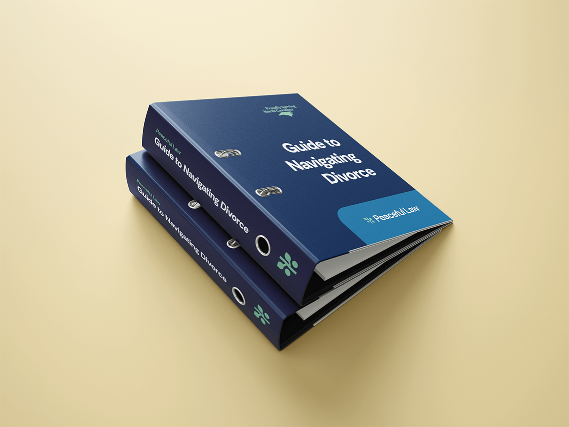
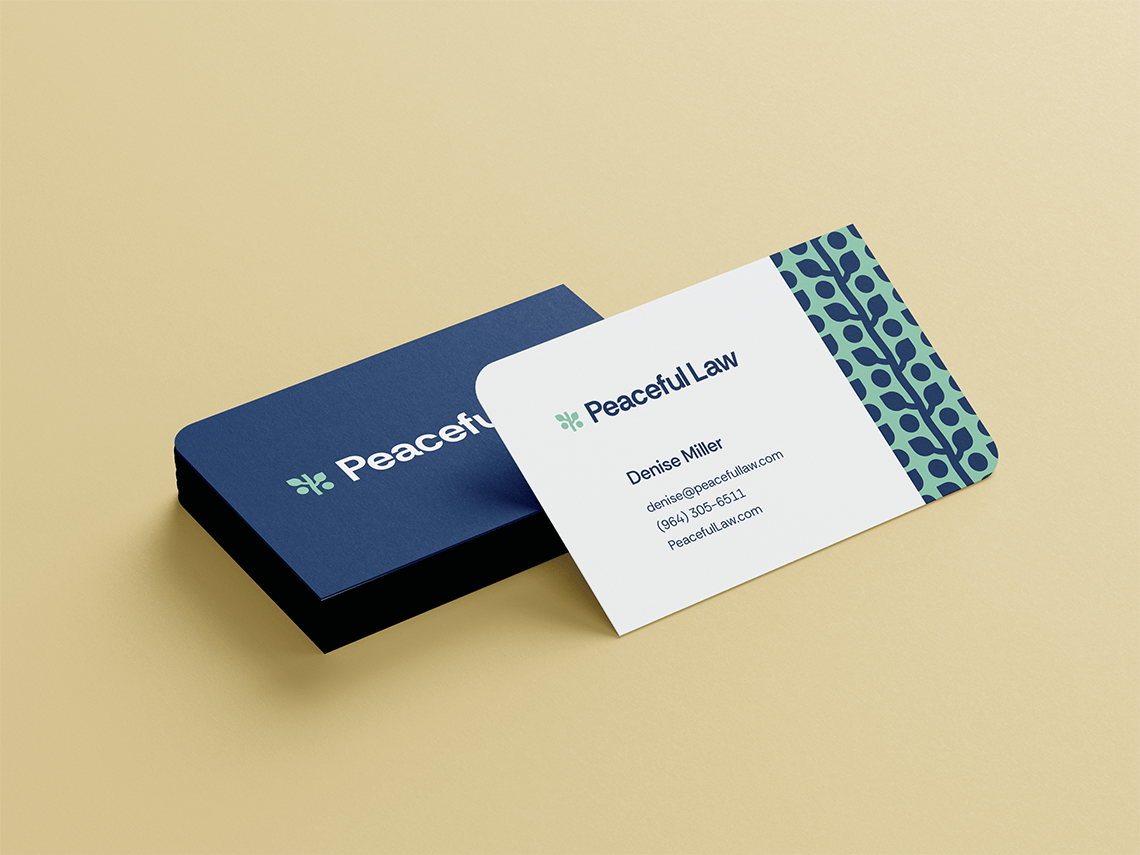
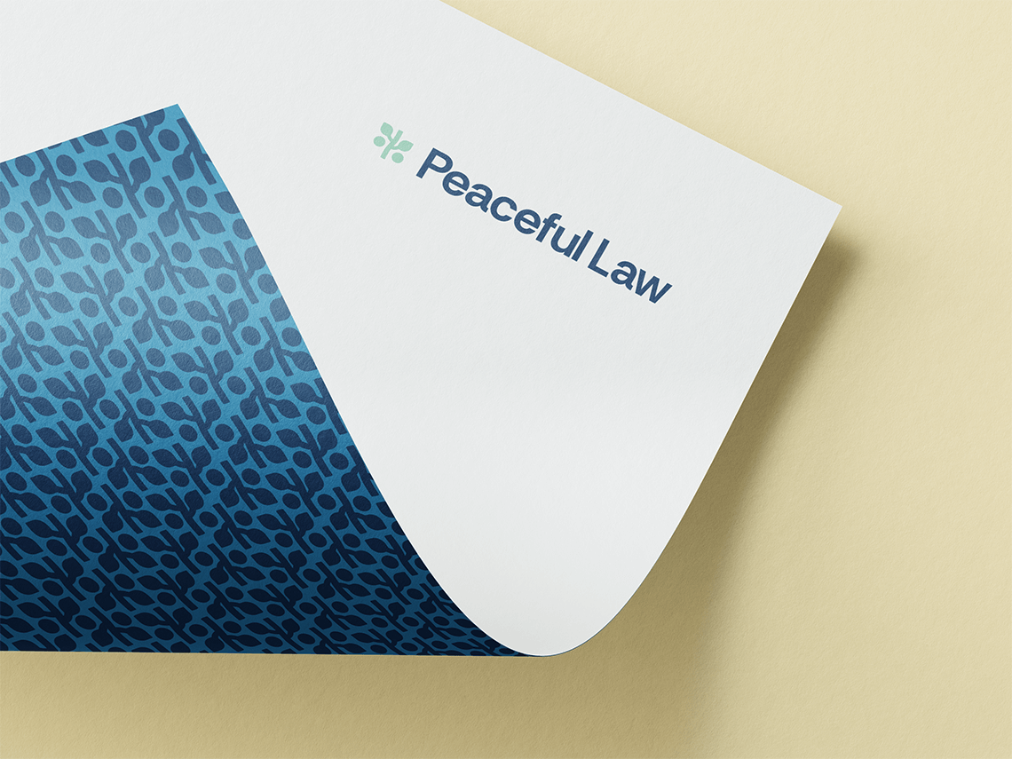
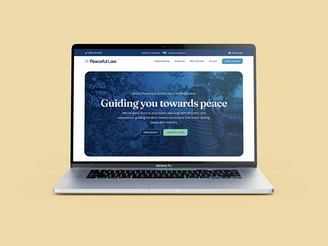
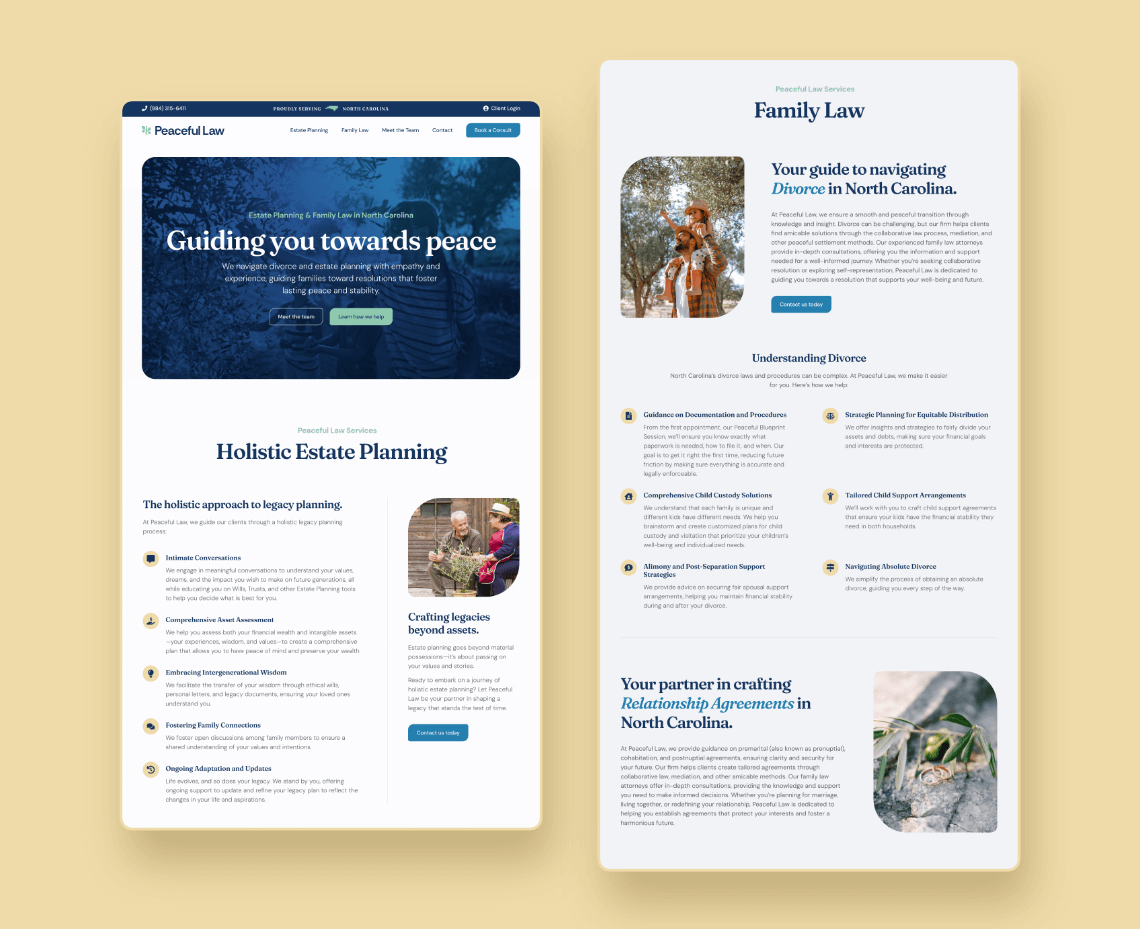
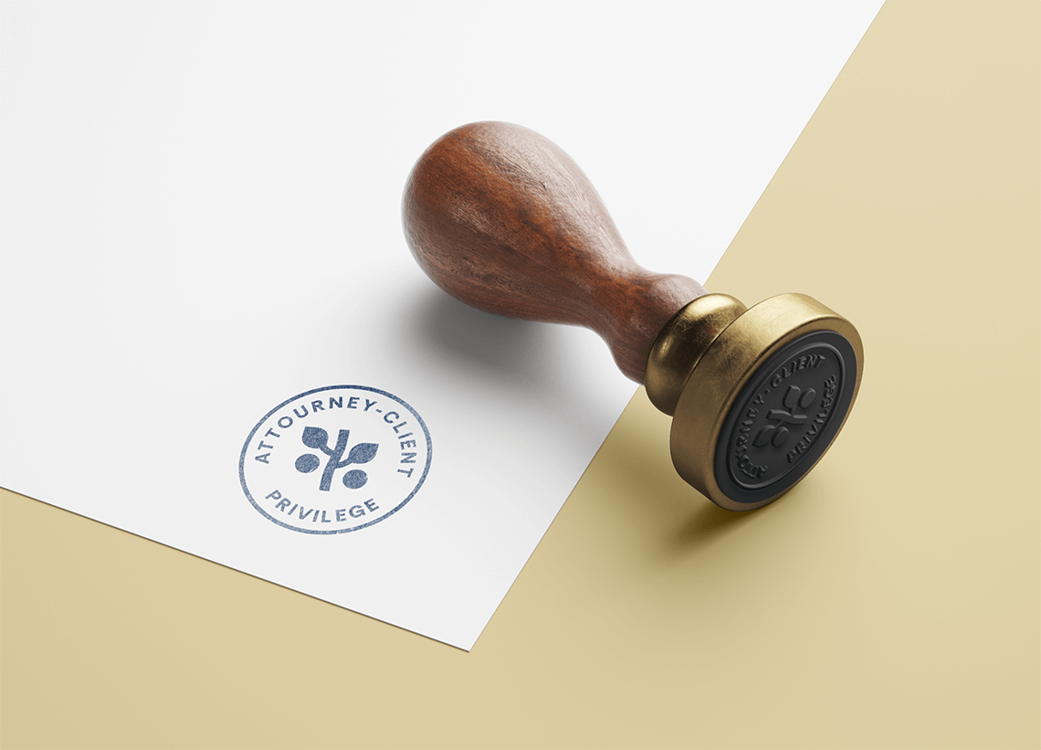
Peaceful Family Law wanted to move away from the formal, intimidating visual language often associated with legal services and create an experience that felt more approachable for families navigating difficult decisions. I developed a warm, modern identity system built around clarity, trust, and a sense of calm, then carried that direction across the firm’s website, typography, print materials, patterns, and supporting brand assets. An olive branch became the central visual motif, connecting ideas of peace, family, growth, and common ground without relying on traditional legal symbolism. The result is a flexible visual language that feels professional without becoming cold, giving the firm a consistent and recognizable presence across both digital and physical client touchpoints.
An olive branch grows, representing the family, with leaves representing the parents and olives representing the children. The bend in the stem symbolizes the brand’s flexible process, while also suggesting that the growth is never one-sided by bending back and forth.
Also representative of two parties ‘meeting in the middle’ (with stem representing the table in this case), suggesting the common 4-way conversation in collaborative law. The stem of the branch symbolizes that both parties, while separate are still part of the same shared interest/growth.
The abstract representation of a timeline ties in not only the estate family planning side of core services but also suggests the psychology at play when making decisions for the later generations.
The overall form of the mark is reminiscent of the scales of justice as well. A metaphor for the owners’ own path, as they are themselves creating a fresh take on justice with their new firm.