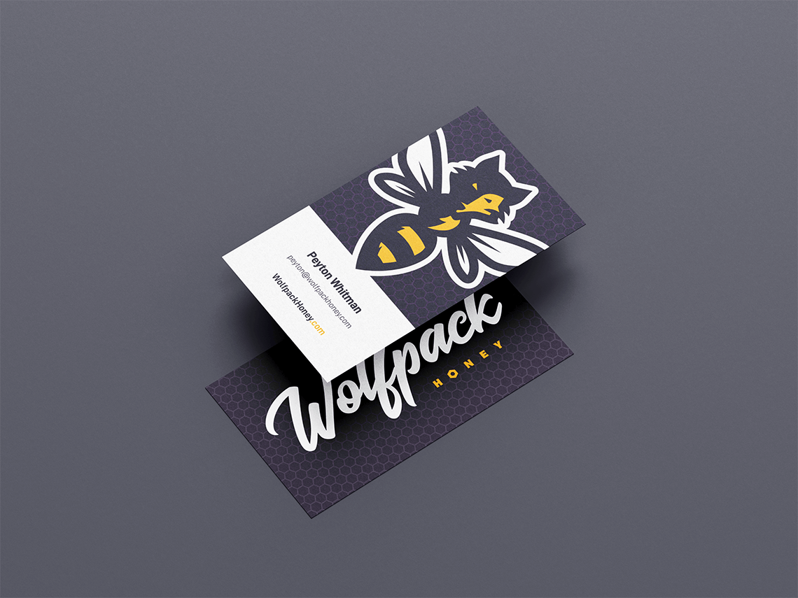
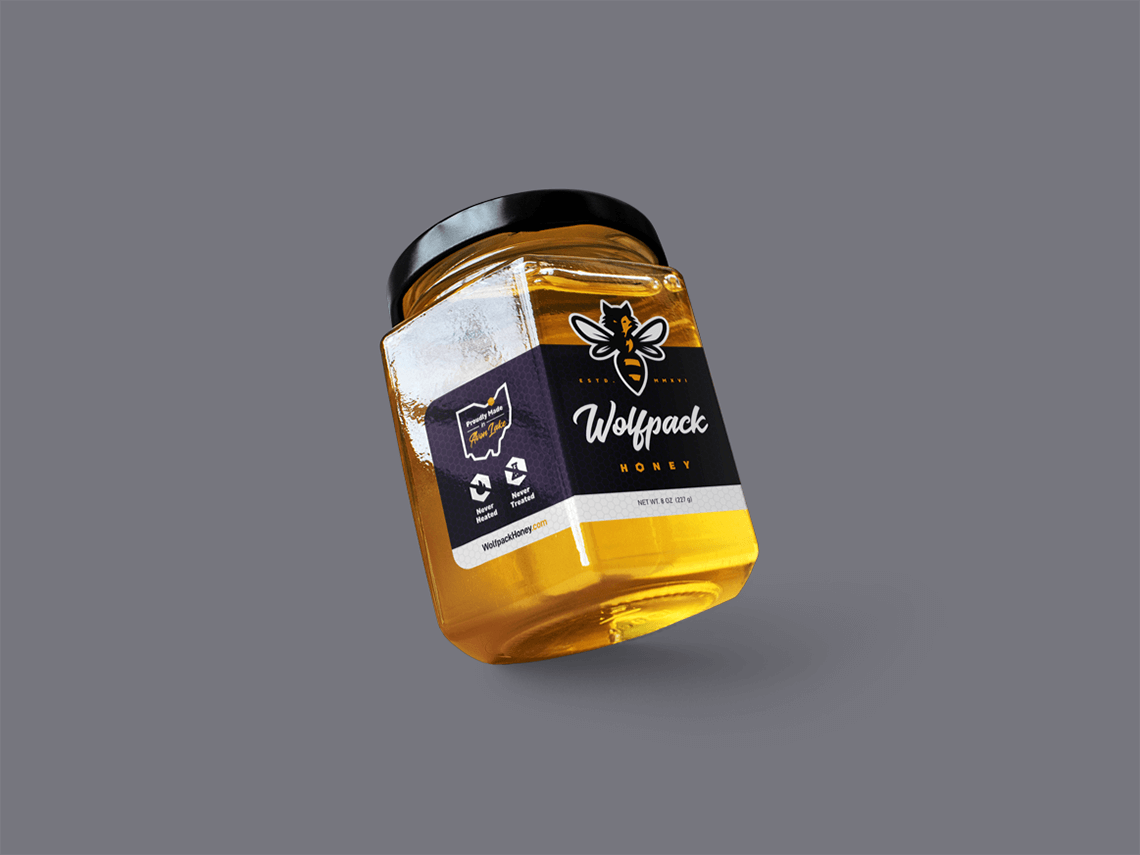
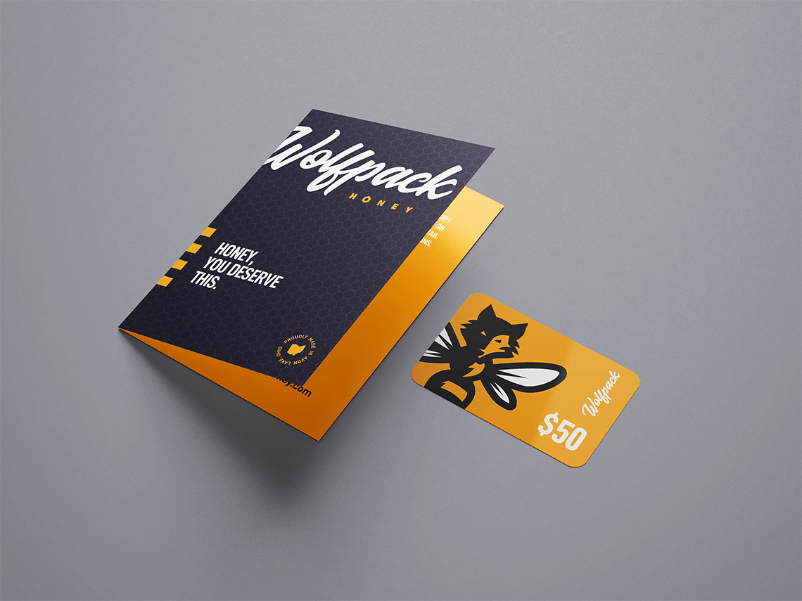
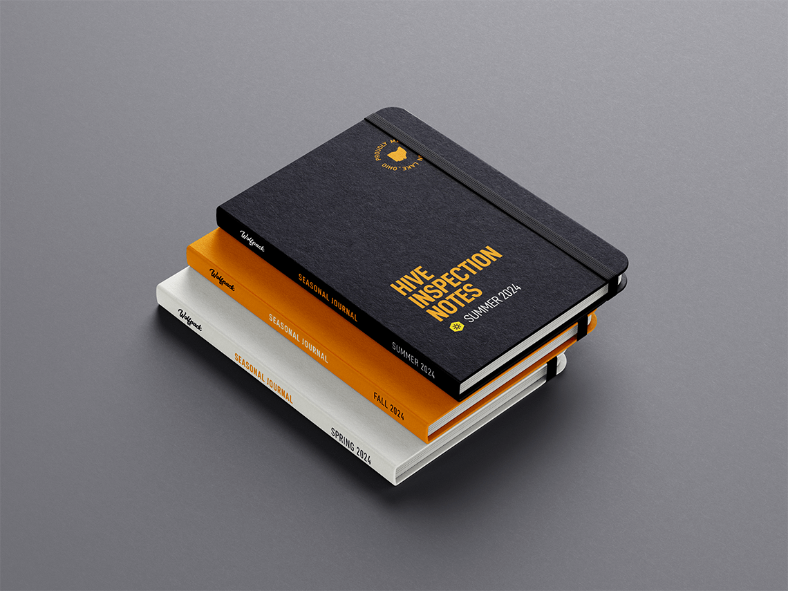
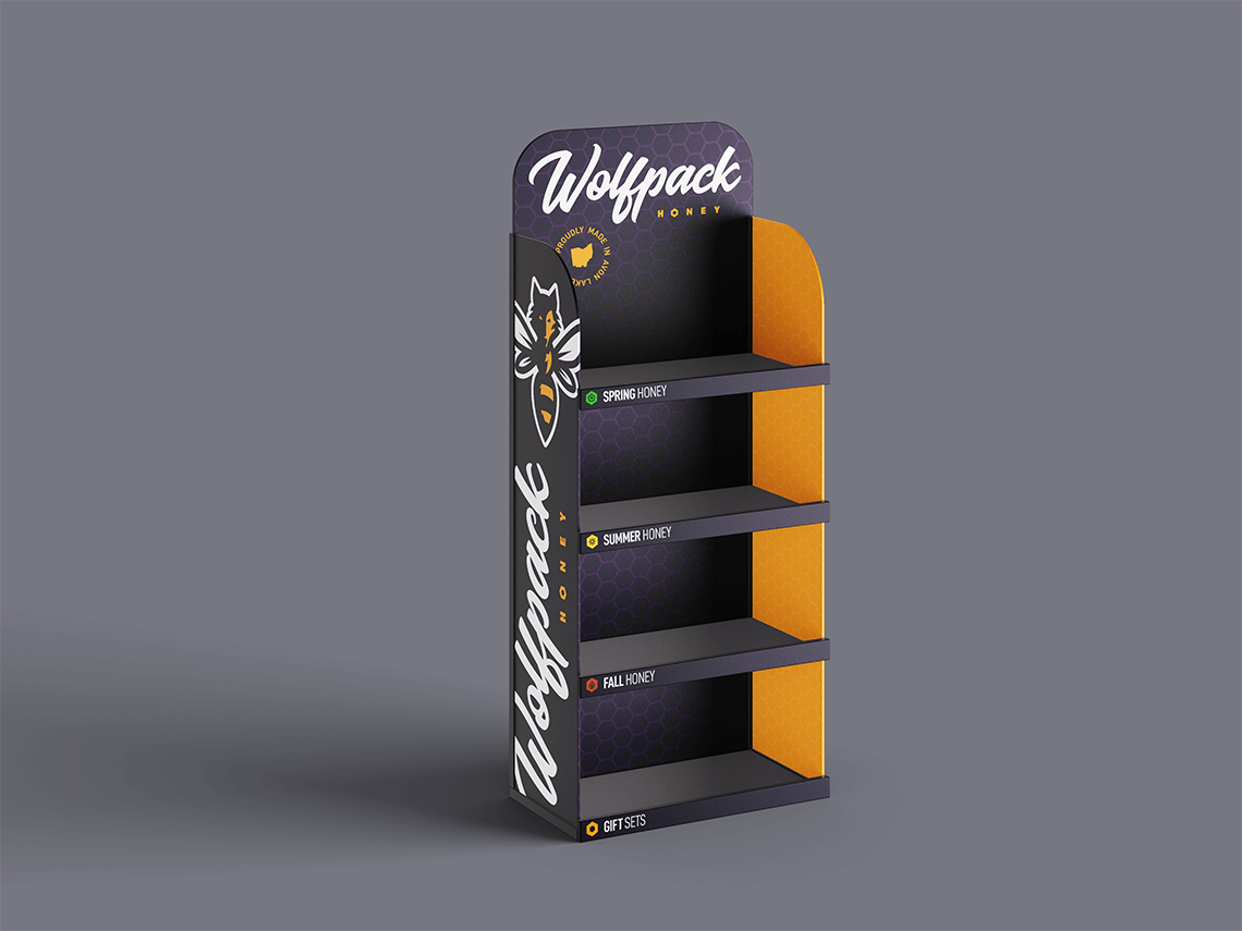
Building a distinctive packaging and retail system around a brand that is equal parts wild and refined.
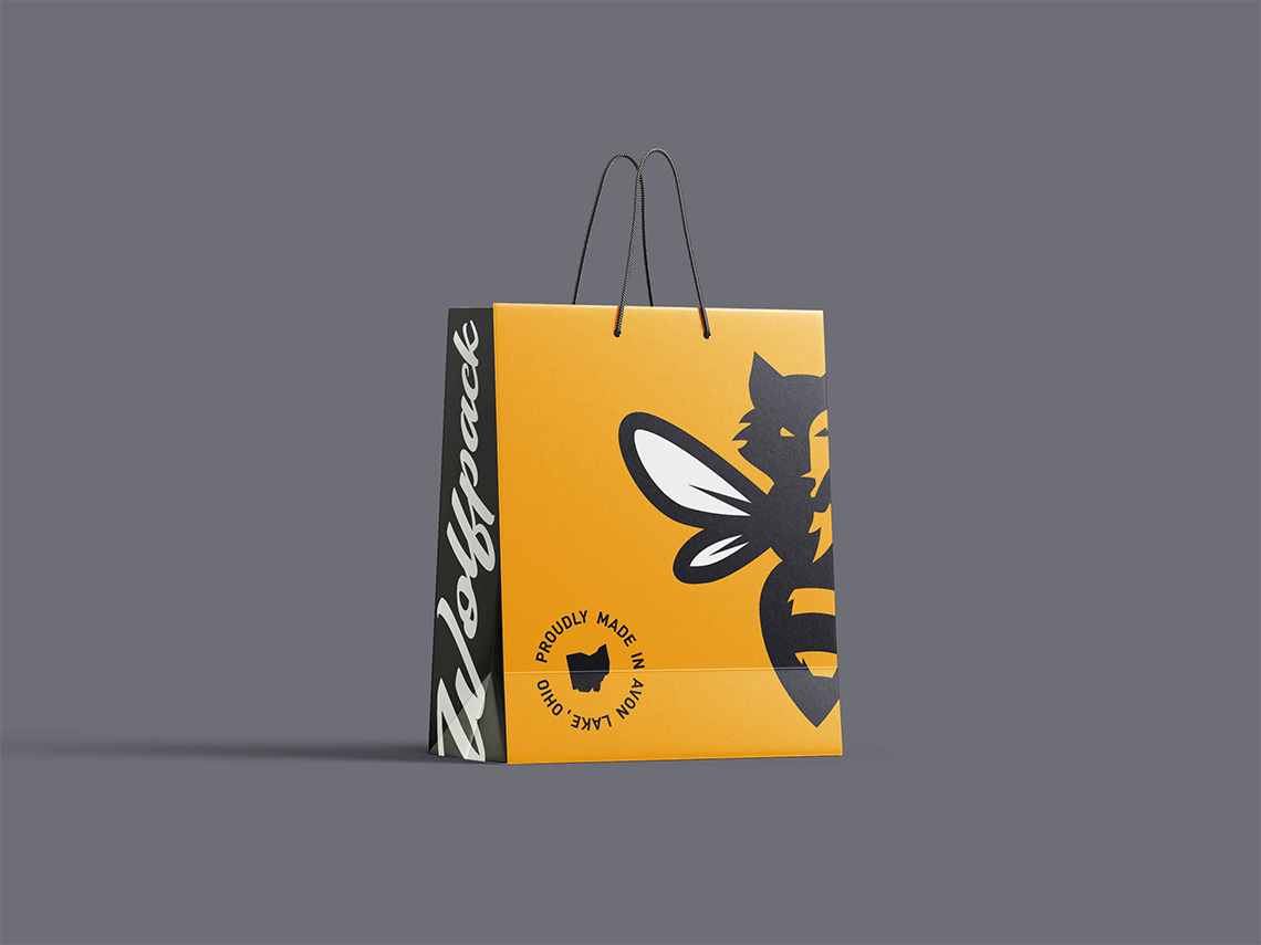
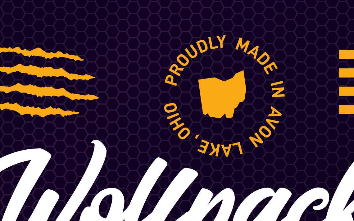
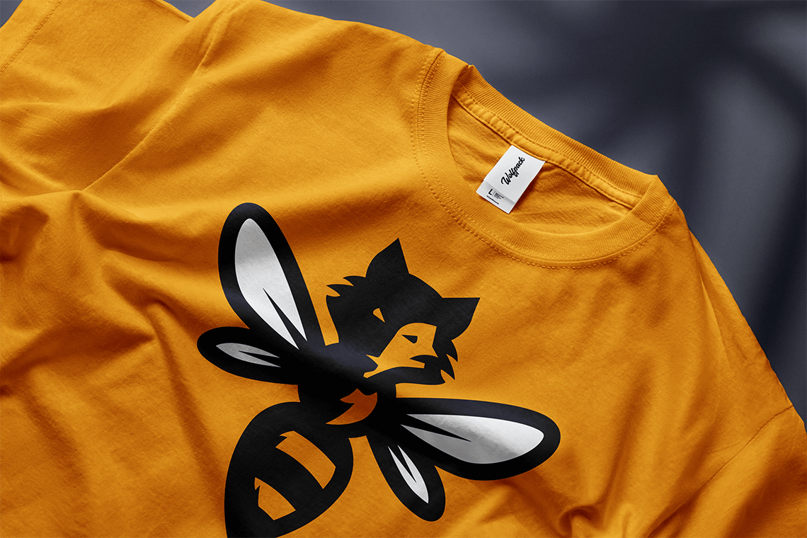
Wolfpack Honey wanted to break away from the rustic, farm-driven visual conventions common to small-batch honey brands while still communicating its commitment to bees, conservation, and local production. I built the identity around a more expressive “wild meets refined” visual language that could carry from the jar itself into retail displays, merchandise, collateral, and supporting brand assets. At the center is the custom-illustrated Wolfbee, a hybrid mascot that combines the loyalty and energy of the Wolfpack name with the bee that drives the product and conservation story. Honeycomb geometry, claw-inspired details, custom typography, and an unconventional purple-and-gold palette expanded that personality into a flexible system designed to remain recognizable well beyond the primary logo.